短视频泛滥的今天,足以证明纯文字或者纯图像的输出已不能满足人们对信息的摄入。看图太单调,看文字太枯燥,因此不断有设计师开始思考怎么重新设计图文的形式让信息视觉化效果更佳。
信息设计区别于传统的平面设计,它更着重于数据的视觉化。目前,全球范围内的设计师们都在寻求以更创新、更独特、更有趣的方式来展示数据,信息图表就是信息设计中的一个子集,它能够使人们更好地读懂数据。越来越多的国家和企业已将信息图表设计运用于各领域的日常工作中。
信息爆炸的时代正好缺少了这样一种整合信息的手段,而信息图表的形式正好帮助人们解决了这样一个难题。哪怕说信息图表设计不等于视觉设计,但是设计师又同时扮演数据分析师、编辑、平面设计师三个角色,所以信息图表设计师是一个非常重要的身份。
建筑构建起了城市的样子,而信息构建了城市的面貌。信息海报、各种各样的地图、说明书、指示牌、手机界面,信息图表无处不在,信息图表设计师身负着一个重要的社会责任。那么如何学习好信息设计?我在一张海报上获得了回应。
这是来自一位韩国设计师张圣焕先生的作品,拥有23年从业经验的他认为:“信息图表是语境与洞察的艺术”,他的作品让我深刻体会到一个信息图表设计师的魅力。
这是信息万变的世界,各行各业都希望让人印象深刻、难以忘怀,我想信息图表是一种最有效的方法,信息图表设计同时也是一个伟大的社会任务,借BranD这一期的主题,让我们期待看到信息世界那一点一点的成长……
BranD No.41: 看点
1. 大师专访:原研哉、白井敬尚、色部义昭 、滨名信次;
2. 跨界合作:著名法国视觉艺术家、视觉设计师、AGI成员Paul Cox,艺术作品登陆BranD封面;
3. 印刷工艺:首次采用立体信息展示印刷工艺;
4. 著名卡通人物米菲专辑;
5. 随刊附送可爱猫咪信息图表海报一张。


 中国杂志网 >>
杂志订阅 >> 广告/展会/设计行业杂志
>> 创意设计行业杂志 >>
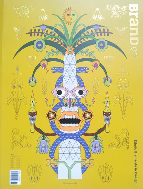
《BranD国际品牌设计》杂志
中国杂志网 >>
杂志订阅 >> 广告/展会/设计行业杂志
>> 创意设计行业杂志 >>
《BranD国际品牌设计》杂志